Thursday, August 28, 2008

Every childs dream.. A tree house for a home

But not the average tree house that your thinking of. There is more than scrap lumber nailed together, more than rope hanging from the edge as your glorious entrance way and more than make believe tea parties happening in these trees.

Architect Joel Sherman, created this steel tree house which got plenty of recognition in 2005.


“All too often people fall in love with the natural environment and then cut down the trees and change the surroundings,” Joel decided to incorperate nature as part of his design.

I don't know about you but i would love to light a fire and curl up infront of this view every night.

And the possibilities are endless with this open floor plan

I never had a tree house growing up, but always wanted one. I always wanted that fantasy hide out where I could excape the world around me.

Maybe someday in the future I will :)

http://www.inhabitat.com/2005/10/02/tree-habitats/

Wednesday, August 27, 2008

Dress your home for fall...

As the seasons change from bright summer days to cool fall nights, so do our wordrobes. We tuck away our shorts and open toe shoes and shop for sweaters and boots. We gradually see changes in the stores, colors get deeper, fabrics gets thicker and skirts get longer. But with these depressing months ahead, comes the feeling of warmth and family and my personal favorite... curling up under the blankets. So if more time is spent at home with friends and family don't you think your home needs a makeover as well. Dress your home for fall. With the simple change of accessories to the more drastic change of wall colors, your space can represent the seasons just as good as you do.


Don't think you have to limit youself to brown and orange, fall colors are all the colors of the rainbow, only the more muted shades rather than vibrant tints. Greens, purples and blues. You can mix it up with accents of bright red or shimering gold. Animal print in small portions and natural materials like wicker baskets and wooden furniture. Larger candles, extra pillows and a new, warm throw with set the mood for the change in seasons.

Some finds...
(from apartment therapy)


This zebra print chair and yellow/gold accent pillow, bring a sence of warmth with an inviting atmosphere. The natural materials such as, the flower pot and basket in the background, all tie into this fun, fall design.


Here you see the brighter colors of the rainbow... With its retro furniture, and modern touches, this room has unique characteristics. The bright trim around the windows, the eclectic style and pattern of accessories and the splash of bright color with saturated accents.

Who said fall was limited to brown and orange?

http://www.apartmenttherapy.com/

Wednesday, August 13, 2008

Panda scare... You need your volume up for this one

I know this is so random, but I couldn't resist :)

Tuesday, August 12, 2008

Inspired by nature

In my color/composition class last quater, we had to take pictures of nature to disect the colors and textures of our surrondings. I went to the lake near my house to find images and inspiration, and fell in love with what I captured. It's amazing how differently you can view an object when you zoom in or angle your camera in various ways. These are just a few of my favorite photos that I may someday use as artwork.
Bark

I dont know about you but i don't see bark on a tree as an image of inspiration, but this close up filled with texture and various intervals of value, might get a place on my wall some day maybe printed in black & white.

Bristles
This is a fun one and great if you need a touch of green. If i were going to hang this on my wall, i would blow it up and cut it into cubes to be placed in a grid pattern on the wall.

Where water meets sand

This calm water against the rough sand brings me peace of mind. I love how the ripples in the lake compliment the layout of the stems on land.

Just grab your eraser

We all fall victim to the thought of perfection, sometimes thats a good thing while other times its just added agravation to our already stressful lives. When it comes to your own personal space, relax and have fun with it. Don't be afraid of making mistakes. Take advantage of what you have, play around with colors and textures and never say "I can't do that". Yes, there are plenty of rights and wrongs in space planning and interior design in general but if it's your space and if you enjoy what you see that's all that truely matters, which means there are no wrong moves or wrong style choices. I like to think of design as a writting process, your first draft is never the final copy. There are plenty of spelling errors and run on sentences that you may have to go back and change. But whats wrong with that? Just hit backspace or grab your eraser. In design you may have to rearange your furniture 5 times, move pictures and accessories all around the room and the one thing that I'm too familliar with, you may have to paint your wall a few different shades to get that "perfect" color. There have been plenty of times where people have doubted my choices and couldn't visualize what I had planned. For instance, my headboard or my desk, some people where skepticle on the ideas, but I tryed them and I'm glad I did. Don't think I didn't have to paint that orange faux finished wall 3 different times either, before finding the one that worked (I'm telling you the paint on that wall has got to be an inch thick). So all I'm saying is don't be afraid to write your story even if you have to rewrite it many times, just remember there is always an eraser close by.

Black ; sleak, sexy, bold. but is it a color or an absence of?

Black can be the safest route to go or the most daring when applied to fashion or interiors. But is black really a color or an absence of? its a complicated explaination that doesn't seem to have a straight answer. some say it is when others say it isn't and when i tried to fiqure it out i just found myself re-reading explanations and still not understanding them. but i do know this; black has a powerfull presence. it can be viewed as sophisticated, bold and eye catching and when joined with a contrasting accent such as white or chrome there is no denying the obvious, with all of this visual power i have to say that black is definatly not an absence of.

He loves me not flower pedal chair by Sand & Birch

How pretty is this chair from Lilly Lace

Wall paper by Graham & Brown

Kitchen by HGTV

Shop at home; literally

Whether you need to tie colors together with art work, hide the bottom of an awkward structure or need a space for computer work and books, you may not have to search very far, your solution could be found right at home.
Tie your colors together

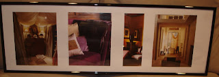
I couldn't find any art work, on my budget, that carried just the right colors or the style that i wanted to portray. So, I cut out some of my favorite images out of an interior design book that i have, and used them as artwork. I placed them in a $10 plastic picture frame which fit right into my budget. I love walking by these images everyday... Just an FYI, I couldn't get a good shot of the picture on the wall from the glare of the lights so i took it down onto my sofa for the picture, sorry if it looks a little funny, it looks really nice on the wall

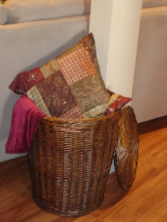
Hide that structure, or what you can of it.

I have this awkward column in the middle of my living room, my sofa is angled in front and when viewed from the back it was an eye soar. A sofa table wouldn't work and i didn't want to close the space up with a room divider. I took this wicker laundry basket (which just delayed my laundry from getting done, being hidden away in this pretty basket) and stuffed it with blankets. I threw a decorative pillow on top and angled the cover so that the entire bottom was hidden. Now, I actually like having the column there, it brings charactor to the space.
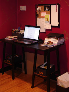
Small computer space

Ok this is not the best picture of my desk, it's alittle messy and i had to place that cardboard in front of my horrible outlets that stick out like a sore thumb... But back to the space. This one isn't as easy as the others and Im quilty of purchesing all of the materials, but you may have them at home. This desk is actually 2 unfinished, wooden counter stools that I bought at AC MOORE, I spraypainted them and a piece of lumber from home depot, black. the lumber is what was used for the top. I secured the piece of lumber to the stools with wood glue, and screws. screwing in from the bottom of the stool seats. the once known foot rests are now covered with bamboo placemats and simple black craft boxes which act as my drawers.
Forget "design on a dime" what about design on a students pay check

We all know that its not cheap to redecorate your home every time you get an erge or a vision, and we all know that if we want it bad enough we will spend the money. but why buy, when you can create. add decorative elements to your home with your own personal touch. here are some fun, affordable ideas that worked for me.

Adding color and texture

This is an easy one. all i did was hang two $20 shower curtains, yes shower curtains, on each side of my sofa table to add pops of color and balance to the room. i purchased curtain rods at the christmas tree shop for $3 a pair. I also found this shear fabric discounted at $3.99/yrd, and hung it on another curtain rod to act as a room divider. i chose to gather the fabric to one side so it wouldn't cut off a visual to the other room.


Boring chairs; Dress them up!

I was getting bored with my pub table with its solid frame and deep wood tone, so i decided to dress it up. i found this shimmering fabric with gold design on the discount rack at my local fabric store, $2.99/yrd. when i found this fabric i had pillows in mind. i quess i got sale happy because i bought enough fabric to make 10 pillows. so instead of flooding my sofa i came up with an idea to lay it over my chairs and tie ribbon threw the spindles. i also rolled up scraps to make matching napkins. this not only helps break up the wood tone but it also ties the two rooms together.

Can't afford accent furniture? You know what I'm going to say. Make it!

Remember the sofa table from picture 1. well yes its homemade. the legs are actually two slender side tables that i have had for years, the top is a $10, plastic picture frame from micheals craft store. I spray painted the inside of the frame with black shimmering spraypaint, and added beaded trim to the front. i didnt want to secure the objects together incase i needed the tables for other uses. so as long as i limit the objects that i put on top, it will hold up just fine.


Monday, August 11, 2008

Interior stories

when thinking about decorating your home, think of it as a story that you are trying to tell. colors and fabrics along with a few minor accessories could add just the right details for your story to be told.
suductive colors, ornate details and a passionate love for rich fabrics all make up this moroccan-inspired, interior story
if i had no budget to work with and a large enough living space, this is the perfect example of what you would see if you walked through my door. i am a huge fan of moroccan inspired atmospheres. i love the deep moroon, violet and gold color pallettes that are usually introduced in moroccan interiors. the iron and solid wood, ornate furnishings along with satin and shear fabrics are all part of this interior story.now although this photo of an event tent is a dramatic statement for a home, you can still achieve a similar feel with the right decorative pieces and color choices without giving your space a "disney world" apparence. as you seen earlier, there are many pieces in my home which i created to be my representation of a moroccan theme. fabrics, colors and detail. here are some other ways that i brought this environment to life, my way.

i used this dramatic color on an accent wall and painted gold stenciled emblems for more moroccan influence


i also used a rustic orange paint with an applied faux finish on another wall to bring in texture from the details

here i used a rattan covered wire purchased at michaels craft store, and hot glued it around a glass vase for an added natural appearance

My favorite decorative accent (purchased)


i had my eye on these canisters for months waiting every day for them to go on sale, they were the only set in the store. fortunatly for me, the store eventually had a going out of business sale and i got them for 50% off. unfortunatly for me, that store was my workplace and my favorite job as an assistant visual merchandiser :(

My favorite decorative accent (made)


this headboard used to be an old, broken down, silver room divider. i purchased it as well, at my old jobs huge sale for under $50. I knew right when i spoted it tucked away in the accessory closet, that it would make a perfect headboard. I spraypainted it a deep chocolate brown, added bamboo sticks to act as a border and with the help of my father welding it together, it's now my favorite piece in my home. not to mention one of a kind.

My confession

Why do i have so many home made pieces? Why don't I just buy? I could have saved up for a new computer desk and headboard. I could have found discount pillows instead of discount fabric. I could have bought a vase that had a natural appareance, instead of spending 8 hours wrapping rattan covered wire around an old glass vase, I would have not only saved myself time but also a few blisters on that one. The truth is, I love to create. Sometimes I can't even sleep because I have an idea in my mind and I can't wait to have it come together. My boyfriend hates times like that, He thinks I'm crazy. But it's truley a passion of mine. Some woman have a passion for shoe shopping or cooking or anything else that makes them feel at ease and complete. Mine is arts and crafts. Sad but true. Don't get me wrong, there is no better feeling than walking in a room with your new, 3 inch stilettoes that demand attention. But theres also no better feeling than putting your own thoughts and time into a project, stepping back and seeing it come to life. This is what got me to go to school for Interior Design. So what if having a passion for arts and crafts at 25 years old sounds crazy, I wouldn't want it any other way.

Friday, August 8, 2008

Want it... Need it... What the **** is it?

Want it... This pendant from lightmyhouse.com is so pretty and if I had $500 to spare i would buy it in a heartbeat. How beautiful would this look in the right dining room over just the right table? What a statement.Need it... Light emitting wallpaper by Jonah Samson. Lights up with the touch of a button, when you turn it off it goes back to its original state of wallpaper. It was created to show that 2 dimensional pieces could be a great source of light. Creative and magical.

What the **** is it?...OK, now im all for modern furniture and simple design, but i just don't get this one. And no it's not exersize equipment it's an accual chair. Anything with a metal back rest and sturups seems scary to me and any woman at that. I'm not dissing the designer (varier furniture) by any means, we need people like this to challenge our own imaginations, but seriously im scared :)